I Sparked Organic Subscription Growth for Znak Journal

Znak Journal website
Role Freelance
UX/UI + Delivery Lead
Year 2020
Company Znak
The challenge

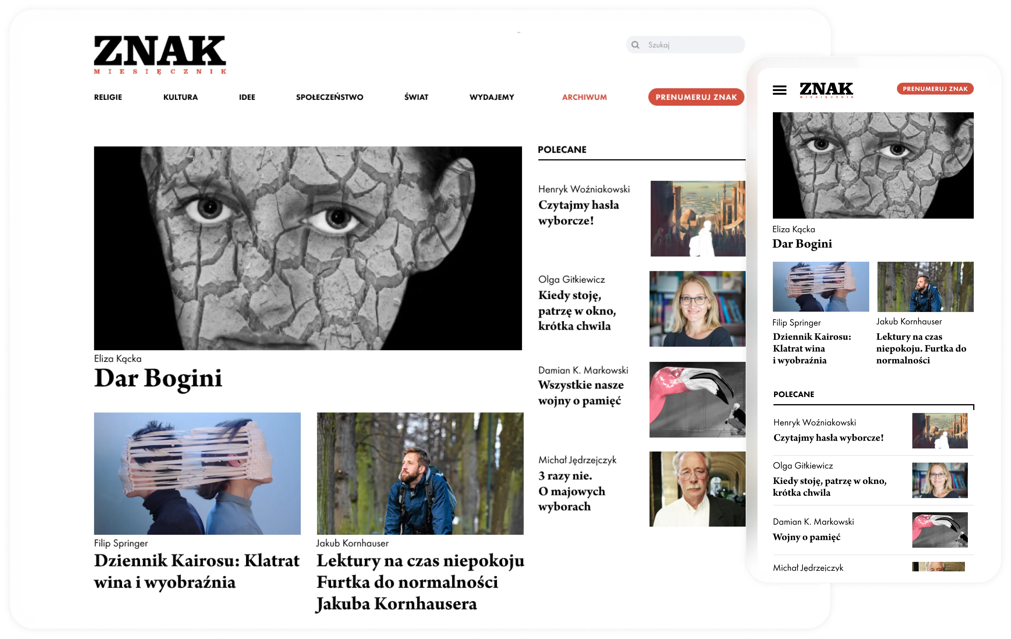
Znak, a prestigious print-first magazine, had a weak digital presence, offline-heavy subscriptions, and low reader retention. The website failed to reflect the quality of its editorial content or support scalable subscription growth.

The bet

I bet that simplifying subscription choices, improving content discovery, and launching a frictionless online checkout would unlock digital revenue — despite limited time for validation. Key moves included reducing plans to three, anchoring annual subscriptions, and redesigning the site to drive deeper reading and conversion.

The outcome

Within one month, subscription page visits skyrocketed, 34 online subscriptions were sold (vs. 0–3/month before), homepage engagement increased, and bounce rate dropped. The project also shifted the company toward data-driven, digital-first growth, paving the way for future paywall monetization.

When a Premium Brand Feels Like a Brochure

Znak publishes thoughtful, high-quality journalism — often compared to a Polish "The Atlantic". Yet the website did not reflect that quality.

Data confirmed the problem:

Quantitative insight

86% bounce rate

Quantitative insight

12% returning visitors

Quantitative insight

1.24 sessions per user

Readers arrived and left. Subscriptions were mostly finalized via phone. There was no scalable digital revenue engine.

This wasn't just a UX issue.
It was a business vulnerability.

Designing Without Time for Research

There was no time for formal user research. Instead of slowing the project down, I built a fast evidence engine:

  • Stakeholder interviews to understand fears and ambitions
  • Competitive analysis of Polish and European publishers
  • Google Analytics deep dive
  • Heuristic UX audit of the current site

Stakeholders were visionary but inexperienced in digital product. So I stepped into a dual role: designer and product lead. I worked on:

  • Structuring collaboration
  • Translating editorial values into product strategy
  • Pushing back on complexity to keep the business model scalable

The Strategic Shift: From Website Redesign to Business Model Upgrade

This project evolved from a visual redesign into a monetization transformation.

Key strategic decisions:

  • Reduce subscription plans to three clear options
  • Anchor pricing around a 12-month plan
  • Introduce step-based checkout
  • Enable online payments for the first time
  • Redesign IA to drive content exploration

I pushed back on expanding subscription complexity. More options felt safer to stakeholders — but would hurt conversion.

Designing Within Constraints

This project required innovation within boundaries:

  • No extended validation cycles
  • Limited digital maturity on the team
  • Balancing editorial tradition with business modernization

Instead of slowing down, I:

  • Anchored decisions in behavioral principles
  • Used competitive benchmarks as confidence builders
  • Facilitated structured stakeholder workshops
  • Took full ownership of trade-offs

From Landing Page to Long-Form Platform

The result was an immersive, distraction-free reading experience built on a clear and confident typography hierarchy. Articles were thoughtfully connected to their respective issues and related content, encouraging deeper exploration. The overall experience was designed to feel closer to the print edition — calm, structured, and intentional.

Strategic decisions

Offer selection

Offer selection

I've reduced subscription plans to three clear options and anchored pricing around a 12-month plan.

Subscription Flow

Subscription Flow

The old process felt administrative and friction-heavy. I redesigned it into a guided 3-step journey: Offer selection, Personal & delivery details, Online payment.

Information Architecture

Information Architecture

I decomposed the entire content ecosystem and rebuilt navigation around exploration and editorial depth.

Outcomes

For users

Improved readability and navigation increased homepage-led sessions and reduced bounce rate.

For product

Introduced a lightweight design system, reduced typographic inconsistency, established systematic analytics tracking

For business

100% increase in subscription page visits YoY

34 online subscriptions sold in first month (vs. 0–3/month previously)

36% more sessions starting from homepage

Bounce rate decreased by 3%

Feedback

This finally feels like a proper website for Znak. It's much clearer than before and way easier to navigate.

Feedback

The reading experience is much better. It feels calmer and more focused, like the print magazine.

Feedback

Love the new Znak website — finally! It's clearer, easier to navigate, and feels much better than before. Hope you keep it updated.

What Didn't Move (Yet)

Returning visitor rate did not significantly change within the first month.

This revealed the next challenge. Retention requires lifecycle thinking, not just structural redesign. If continued, I would focus on:

  • Newsletter growth loops
  • Content personalization
  • Habit-forming engagement triggers
  • Editorial-content cross-promotion strategy

What This Project Changed for Me

This was the first project where I operated not only as a designer — but as:

  • Product strategist
  • Business partner
  • Decision owner
  • Facilitator of organizational change

It taught me that senior design is not about polish. It's about clarity, trade-offs, and driving measurable outcomes under ambiguity.