I helped Staffbase to validate, pivot, and scale a high-risk analytics product

Analytics Dashboard
Role Sr. Product Designer
Year 2024
Company Staffbase
The challenge

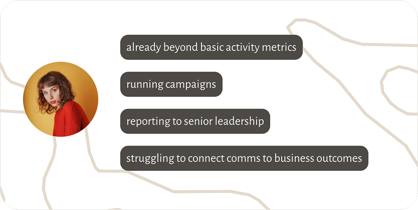
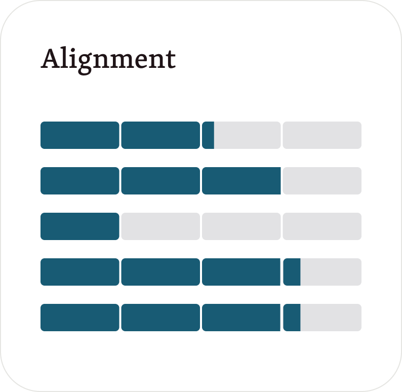
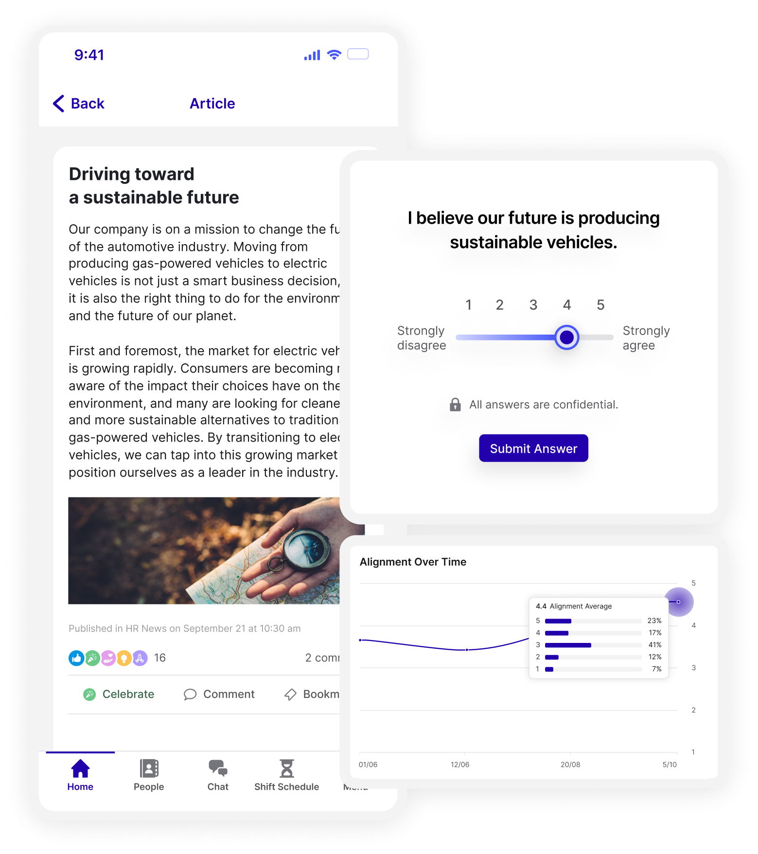
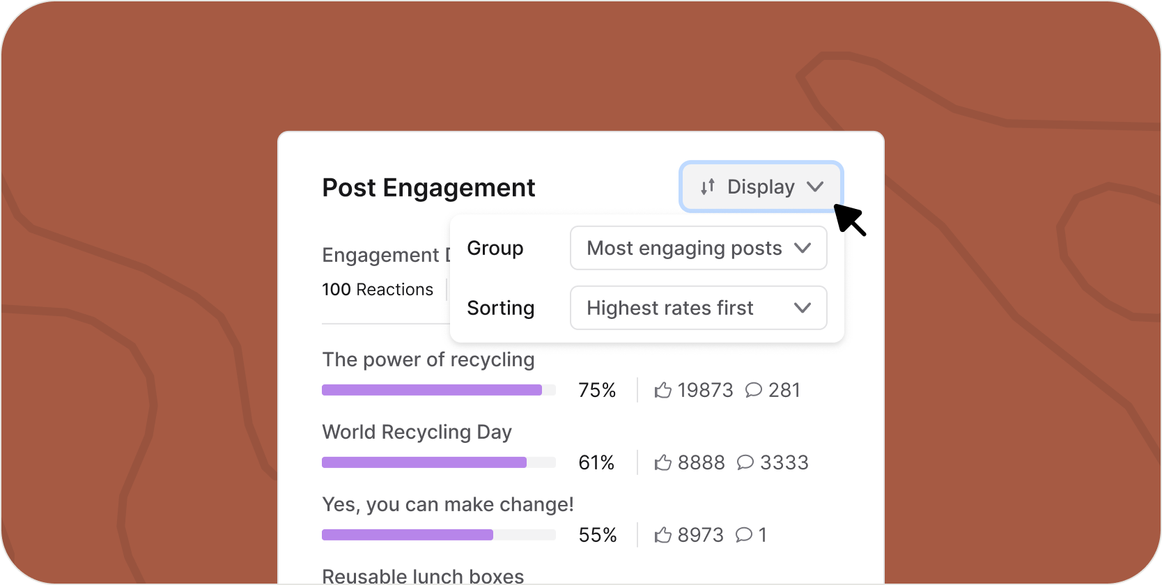
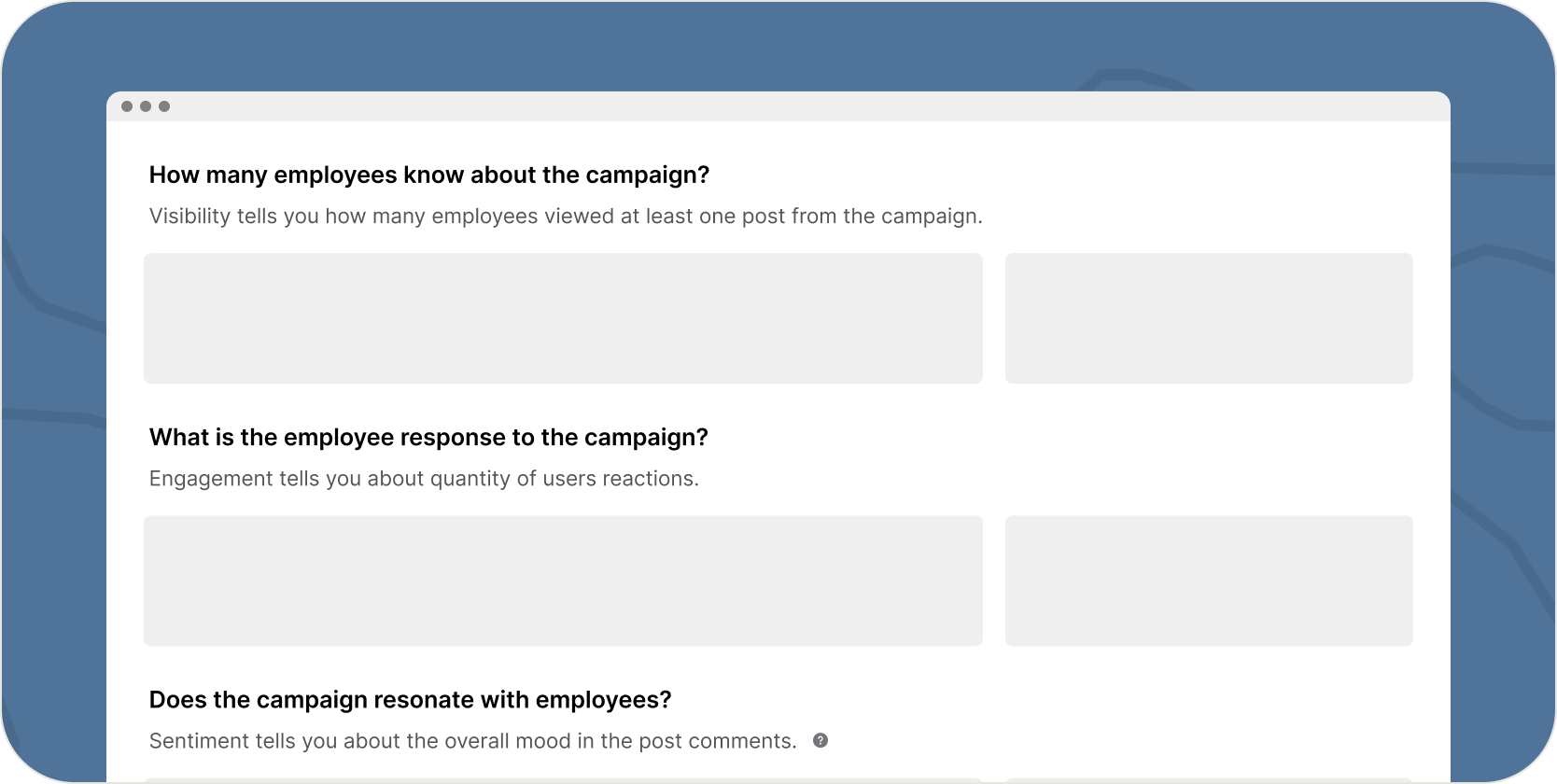
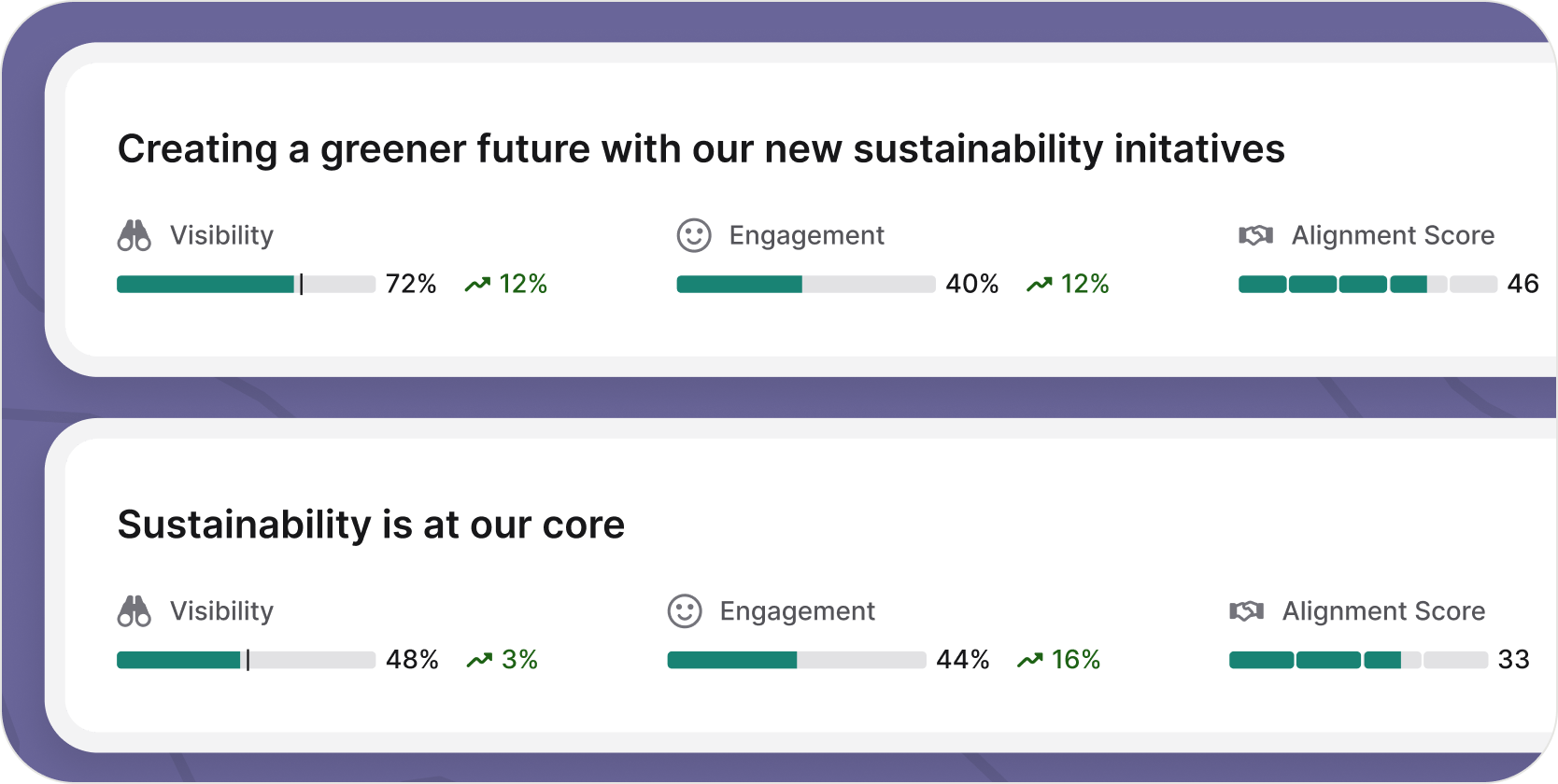
Communication leaders struggle to prove their business impact. Existing analytics tools focus on raw metrics, require data literacy, and fail to translate performance into insights executives understand.

The bet

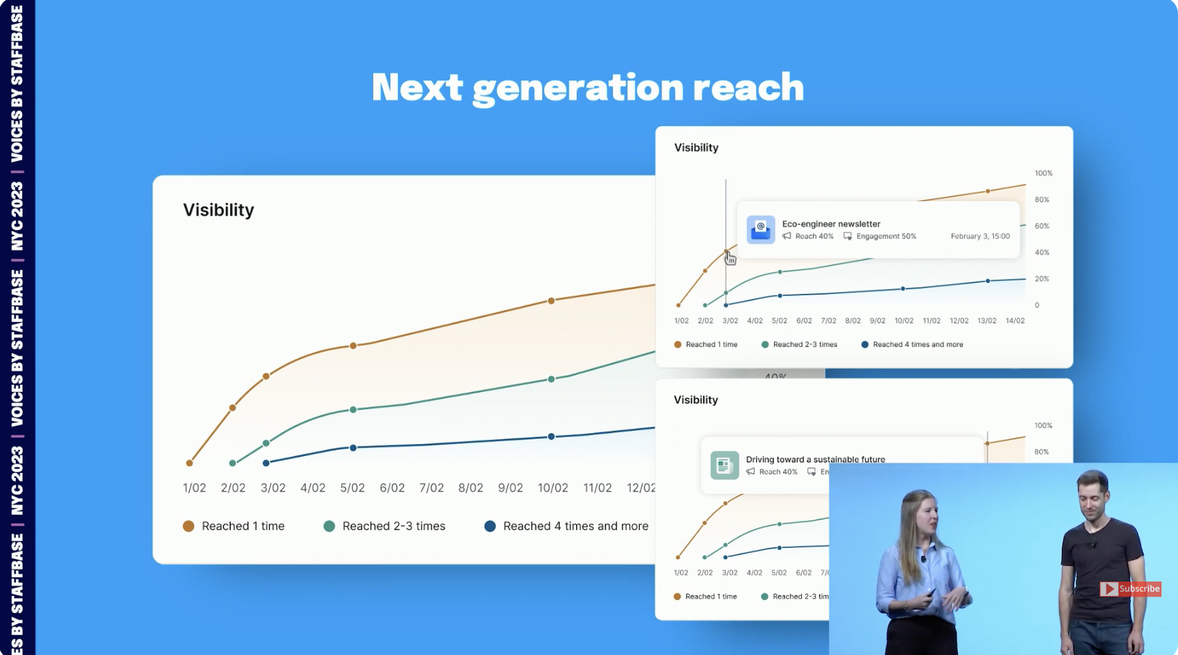
Ahead of Staffbase's flagship conference, we launched an unvalidated analytics concept under extreme time pressure to position the company as a market leader.

The outcome

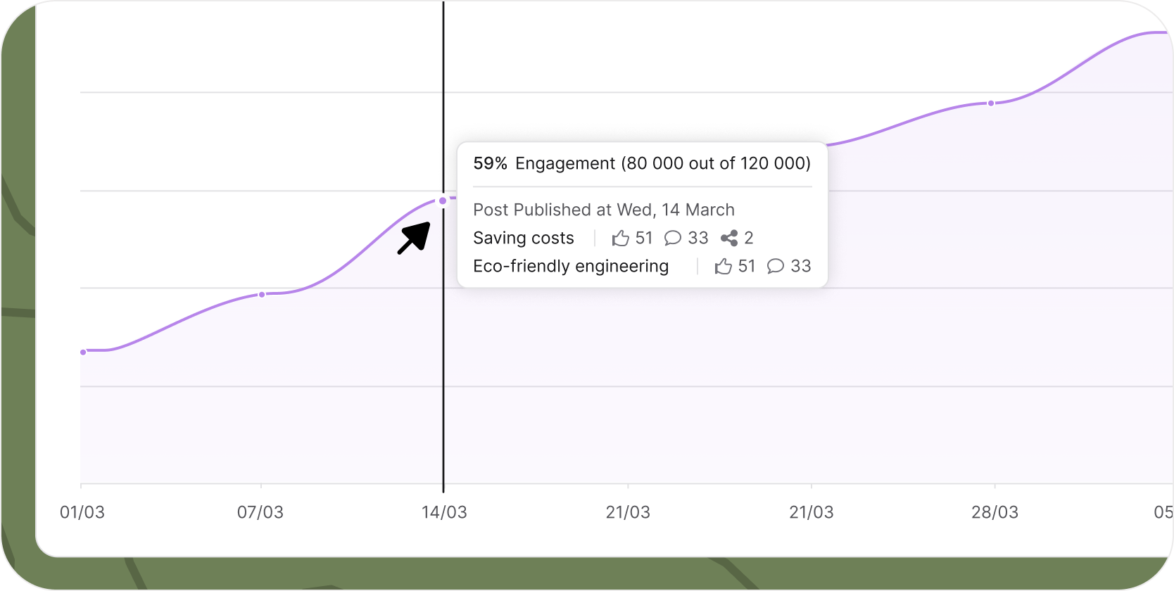
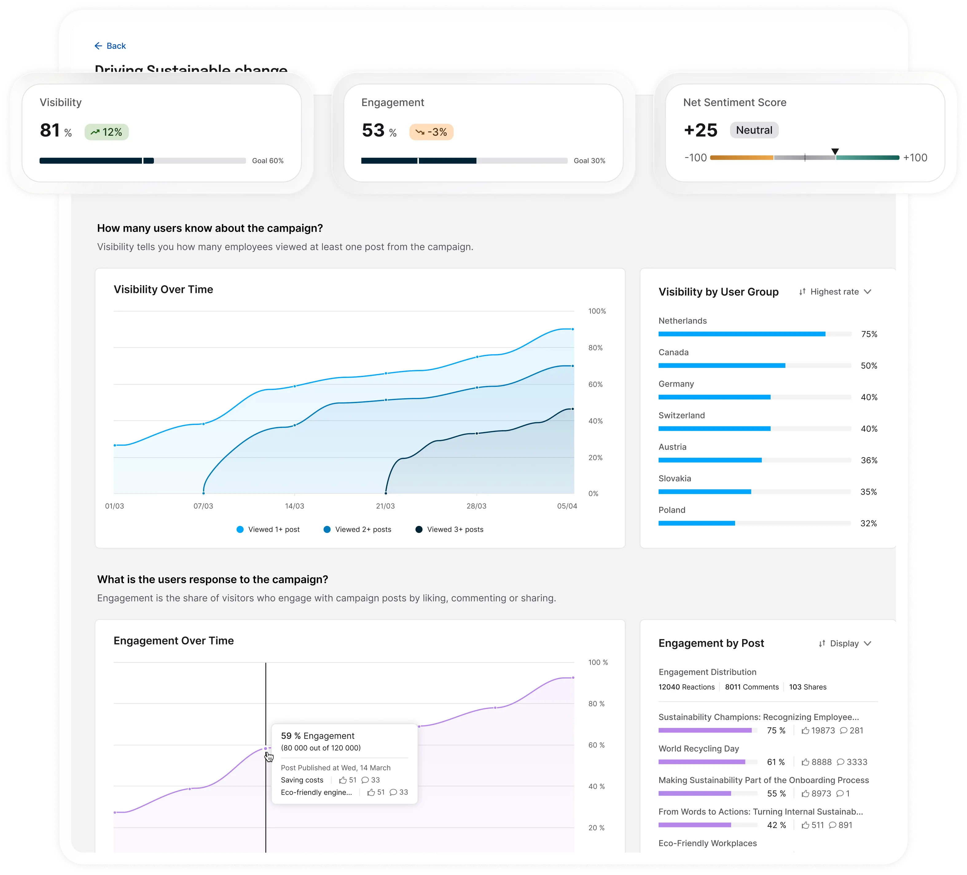
After weak initial market response, we reframed the problem through research and built a campaign-level analytics dashboard that turns communication data into clear narratives. The result became a core selling point for over a year and directly supported enterprise deal closures.

Let's do something fast

Each year, Staffbase hosts its largest industry conference for internal communication leaders. The expectation is not incremental improvement, but a market-shaping announcement.

This project started without a clearly defined user problem. It started with a business mandate: lead the market.

From generative research, one insight stood out. And we decided to take a bet.

Communication leaders struggle to measure and demonstrate their true business impact in an intuitive way.

Why this matters?

  • Proving impact enables larger budgets, executive trust, and strategic influence
  • Without proof, internal communication remains undervalued and tactical

Why existing solutions fail?

  • Analytics tools (including Staffbase's) require spreadsheet work
  • Communication leaders typically come from writing or marketing backgrounds
  • They are not data-savvy

A High-Risk Launch With No Clear Problem

We treated the stage launch as market validation. This was not ideal—but intentional.

Due to conference timelines, we launched a concept based on:

  • Broad research insights
  • Informed assumptions

Result: Interest was significantly lower than expected.

This gave us a clear signal—and permission to reset.

Launch presentation

Comms Teams Need Stories, Not Spreadsheets

We interviewed customers who were not interested in our product to understand why and:

  • How they define "impact"
  • Which metrics matter to them
  • How they report to leadership
  • What decisions analytics should support
Insight

Concept was difficult to understand for many small comms teams

Insight

Many of our customers don't report to leadership

Insight

For many, reporting on the performance numbers is enough.

Yet, there were still some customers who were interested in our proposal. And we found the pattern in who these customers are.

Research findings

This research revealed the real question:

How might we enable all comms teams to take advantage of campaign analytics?

Testing with real data

Instead of prototypes, we tested real customer data.

  • Partnered with a Data Analyst
  • Pulled campaign data from customer environments
  • Built draft dashboards in Excel

We asked users to:

  • Interpret the data
  • Explain insights
  • Describe actions they would take

This revealed:

Insight

Major confusion around visibility metrics

Insight

Demand for audience and group breakdowns

Insight

A need for explicit guidance, not just charts

Dashboard that tells a story

I designed a human-readable analytics product that tells a clear, executive-ready story. This simple storytelling framework enables all comms teams to report beyond metrics and prove how internal comms can inspire change in the organizations.

Reach metric chart

% of employees who viewed at least one campaign post

Engagement metric chart

% of viewers who interacted (like, comment, share)

Sentiment analysis chart

Overall tone of employee comments

Alignment survey chart

Measured by survey under the campaigns posts

Did I move a needle?

We wanted to go beyond number reporting and give users the tool that would show: Yes, we've changed what people think. We found that micro surveys under the articles bring 50% more engagement than comments. Results were fed back to the dashboard as alignment.

Campaign analytics dashboard showing impact measurement

The result – human-readable analytics

Key design decisions

One dataset, multiple answers

One dataset. Multiple answers

The same data supports different decisions. Flexible views let communicators surface what matters and where they need to take an action.

No training required

No training required.

Metrics explain themselves. Plain-language guidance gives users confidence to act, not just observe.

Impact only matters in context

Impact only matters in context

Side-by-side comparisons turn isolated numbers into proof—what worked, what didn't, and why.

Built for clarity, not decoration

Built for clarity, not decoration.

Accessible color choices ensure insights stay readable, credible, and inclusive.

Insight, right on cue

Insight, right on cue.

Micro-interactions connect data spikes to real actions, exactly when users ask "why."

Outcomes

For users

Can clearly demonstrate the impact of their work to executives. Have the tool to gain influence and agency.

For design team

New internal standard for dashboard design and testing. New data visualization color palette and design system components.

For business

Sales used this dashboard in enterprise demos to explain value in under 2 minutes.

For revenue

Direct contribution to closed enterprise deals.

Do I still have your attention?
Let's dig deeper

Role & Team

My role

  • Concept creation and validation
  • User research and synthesis
  • Dashboard and interaction design
  • Usability testing
  • Developer handoff
  • Post-launch feedback and iteration

Team

  • Product Manager
  • Product Designer
  • Data Analyst
  • Backend & Data Engineers
  • Frontend Engineers

Before the conference, I partnered closely with a senior marketing stakeholder and another senior designer to shape the initial concept.

Goals & Success Criteria

If communicators could clearly demonstrate the value of their work, we expected:

  • Increased strategic visibility of internal communication
  • Easier upsell of advanced analytics packages
  • Reduced churn among enterprise customers

Success was evaluated through:

  • Sales enablement adoption
  • Qualitative feedback from enterprise prospects
  • Contribution to closed deals

Challenges

#1 Building under executive pressure

  • The project started as a marketing-driven initiative
  • Product teams were skeptical of the approach
  • We reframed the launch as early validation
  • Once the conference pressure passed, we shifted fully into research-led product development

#2 Making analytics understandable

  • Early interest was low
  • Research clarified needs, but comprehension remained a challenge
  • We ran two focused rounds of usability testing on: interpretation, confidence, decision-making
  • Dashboards require iterative testing focused on understanding, not just usability.

Reflection

This project reinforced that:

Learning

Shipping under uncertainty is sometimes unavoidable

Learning

Early validation—even when uncomfortable—can accelerate learning

Learning

Great analytics products blend strong data with clear narrative and confidence.